Overview: Associate reached out for a personal real estate website upgrade as their current website was outdated and was giving users a negative experience. The associate also wanted to consider new home buyers as they are a target audience of his.
Problem: Realtor felt distant from clients. Clients were not able to find information they were looking for and users did not feel confident of the Realtor with the current website and information provided.
Solution: I designed a responsive website catering towards both Realtor and user experience needs ensuring a overall more confident and informative experience.
With my previous experience dealing with stakeholders, I adjusted my process a bit more when handling this project. I interviewed with my associate and had come up with a persona for them and a user that would use the website through research. I created a journey map to empathize with the user through out the process of viewing pictures of a listing. I then completed a competitive audit for my research and started to sketch ideas of a real estate website. I evolved my ideas to a prototypes that were tested and had gone through iterations for improvements of user experience which led to my final design.
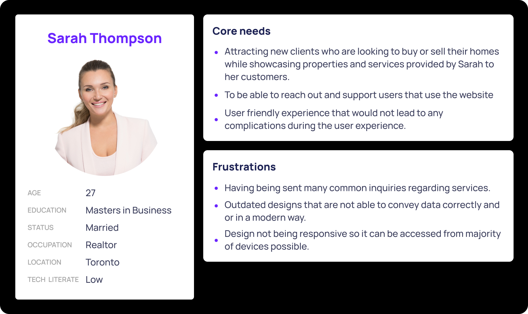
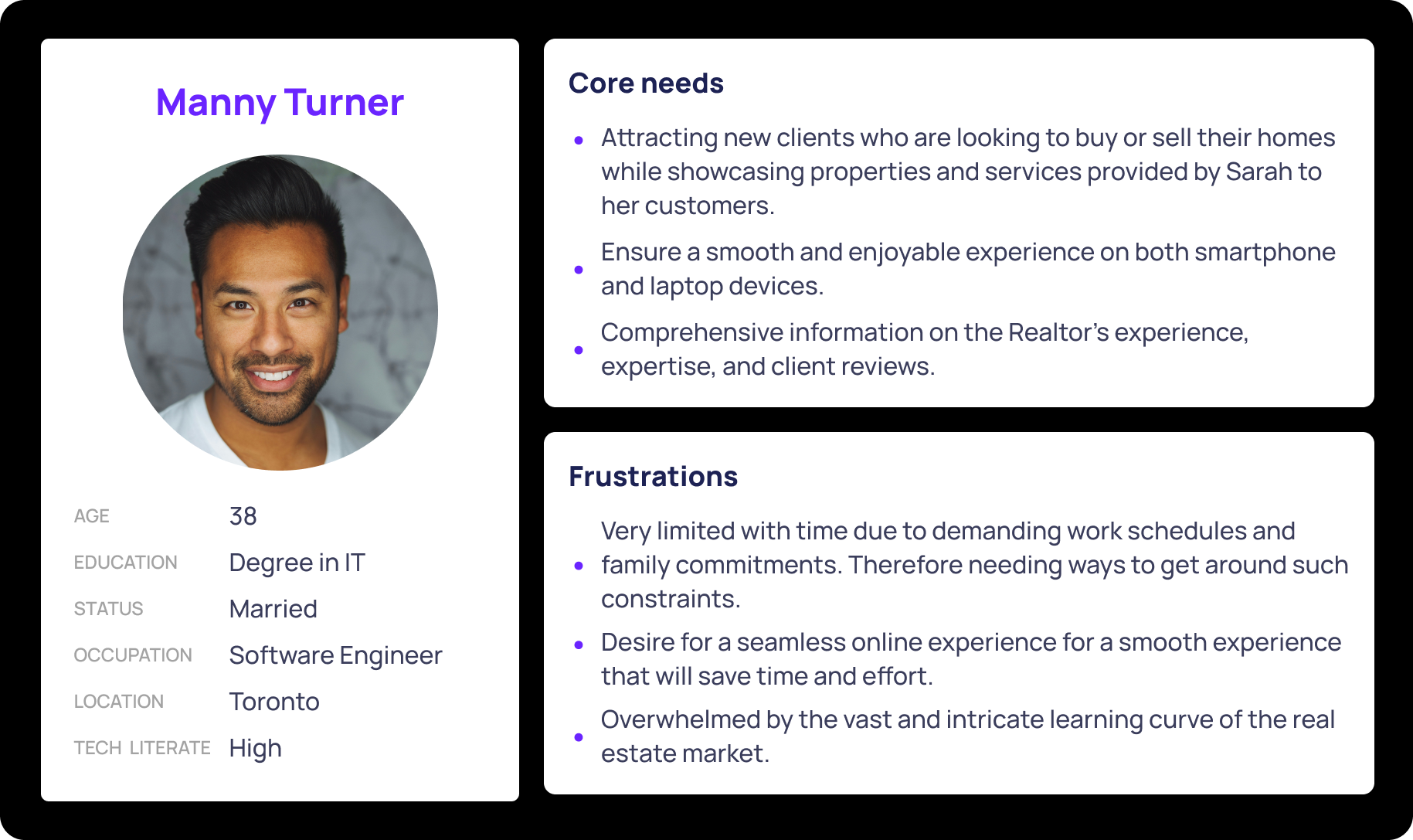
When conducting user research, I was able to take down pain points and core needs of user from the previous client and online real estate websites and create a persona representing them. Below I have a persona of a Realtor and a user. I made both personas to break down both the stakeholder and user needs.
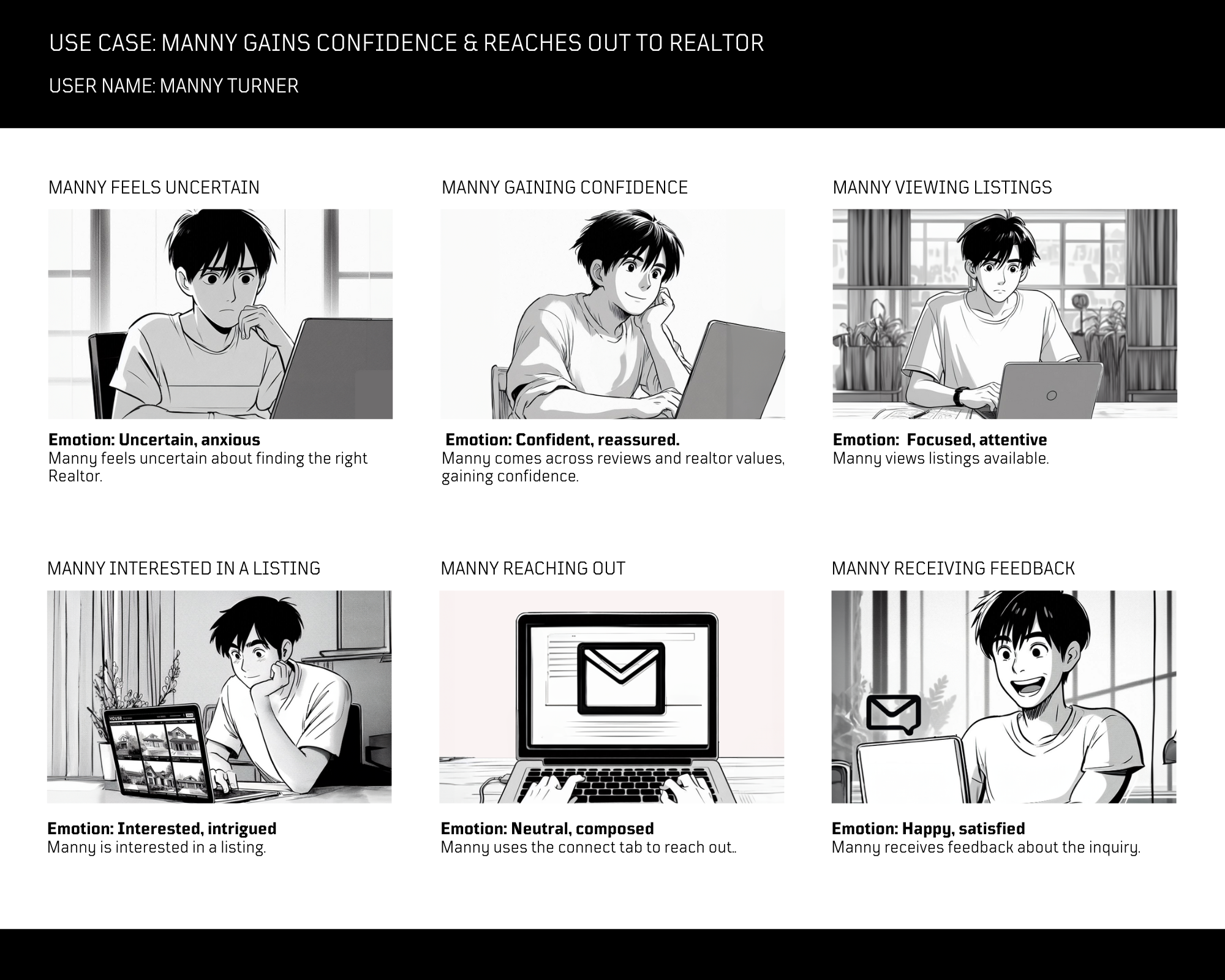
For better understanding of the process and emotions Manny would go through, I created a user storyboard to better empathize with users. I was also able to think of possible user flows and pain points that could affect the user experience.
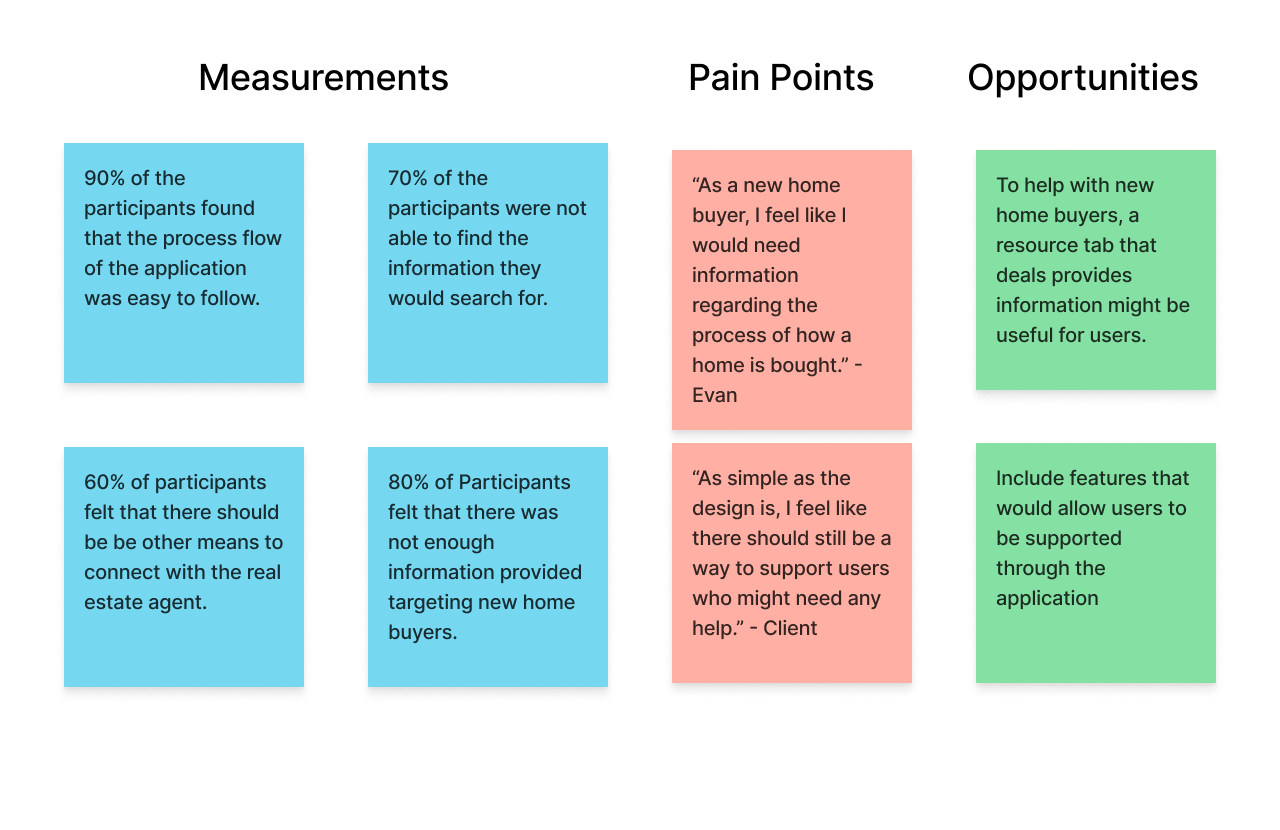
I conducted a usability study on the high fidelity model I created. With the sample pool of 10 people, I gave users the same exercises and questioned them regarding their choices and emotion after task completion. I noted down points that I found could help better the user experience. I found that 60% users wanted more ways to connect with the agent and 80% of users still felt that there was missing information for new home buyers.
With my high fidelity design for UrbanScape Realty website, I had made three iterations to the application. Through the usability studies, I was able to implement feedback into the final design. My goal was to create a easy to use product that that would support users and build confidence themselves and with their Realtor.
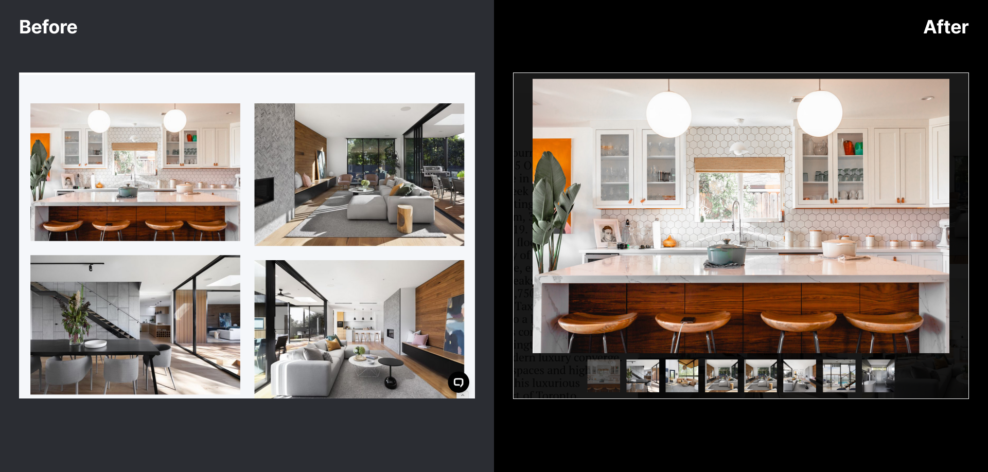
Previously the pictures were not able to actually zoom in and could not be seen closely. As of now a feature was implemented so pictures can be clicked on and seen as a slideshow. The iteration increased efficiency and added more accessibility as it would allow to zoom into images.
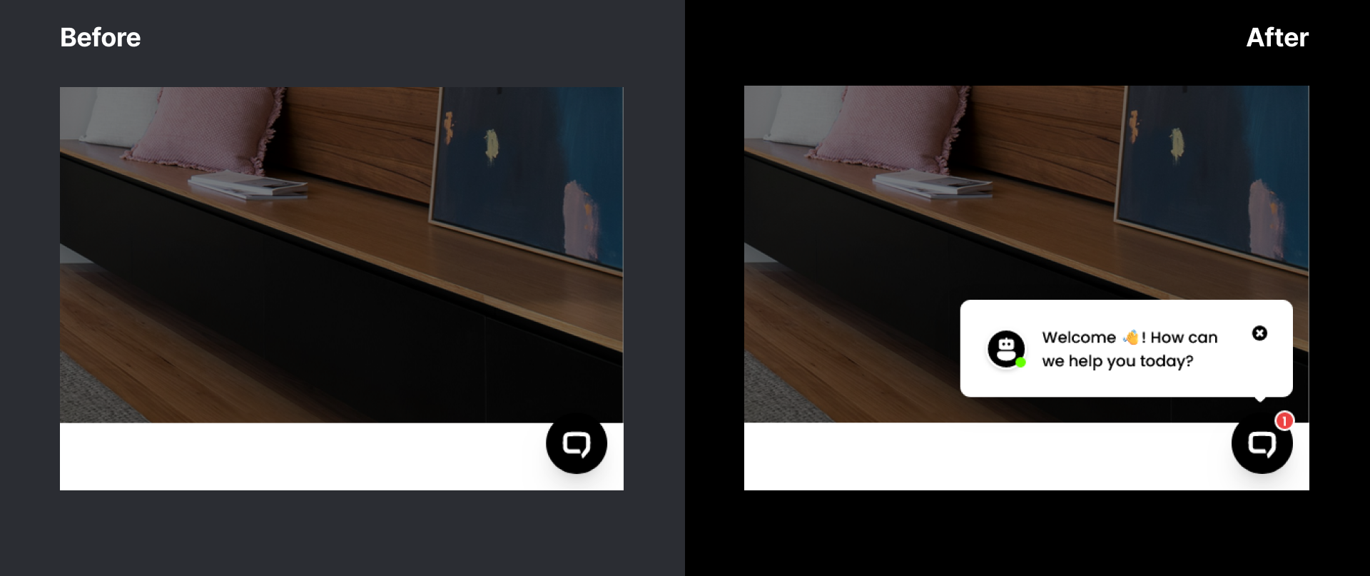
During the usability studies, I noticed users were not able to see or interact with the AI chat bot. The chat bot was not noticeable at all so the notification window was added. The chat bot not being noticeable was keeping users away from it, leaving a form of support being hidden. Users can have their questions answered since the chat bot has learned everything about the website. To help I added notification so users were aware of the chat bot.
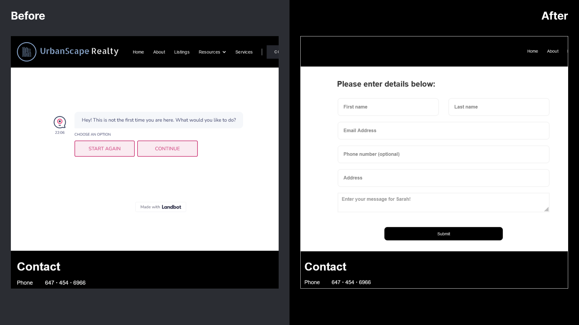
Another design iteration I made was with the connect page. I was using a separate bot for this page that users did not want to interact with. I took the bot out of this page and users found the new form a lot better and had enhanced user experience because it was very simple to use.
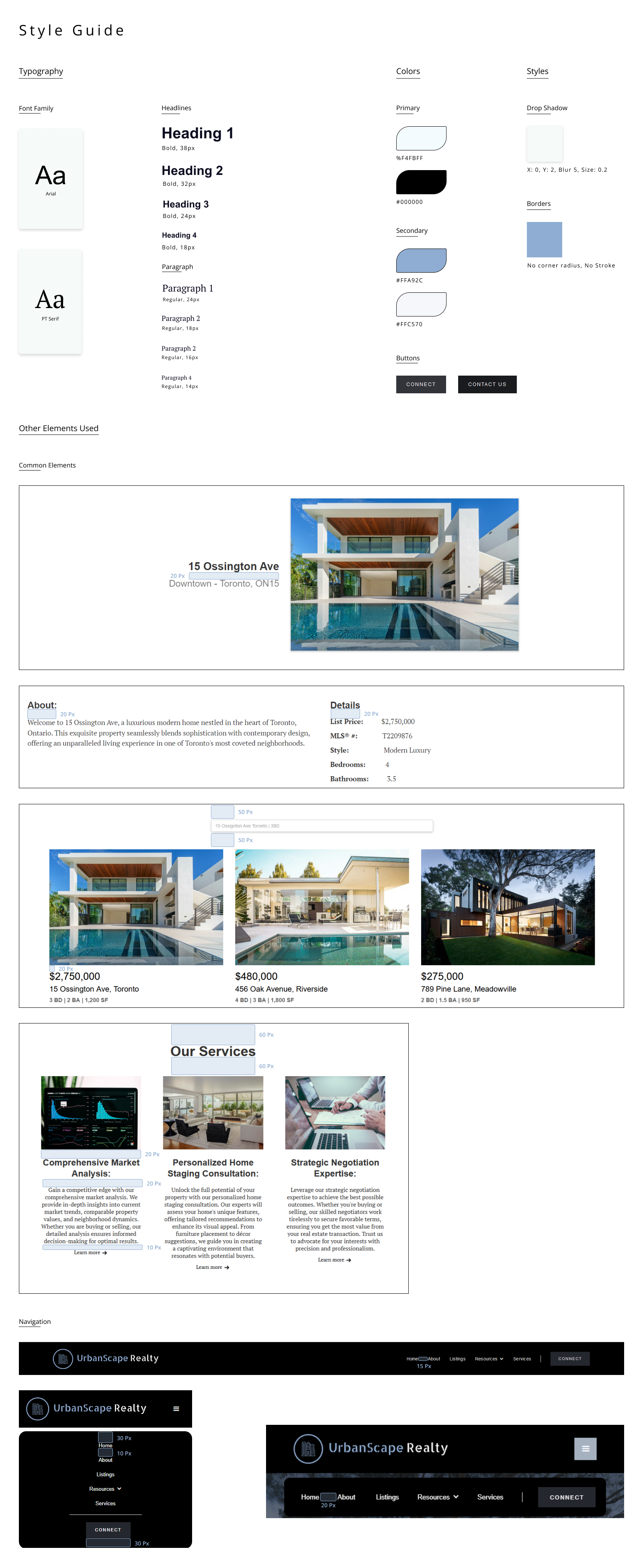
By selecting high-contrast colour combinations and avoiding problematic pairings, I was able enhance readability and navigation for everyone. This approach demonstrates my commitment to accessibility, complies with standards like WCAG, and improves the user experience for all, including those with colour blindness.
I performed another usability study for the final design. I had gotten the same users from the previous study to perform tasks and give opinions on certain elements of the website and the new iterations. I received positive feed back on the study. The study conveyed that all users able find the information that I asked to find. My results also shows that the pop up chat bot deemed itself useful as more than half of participants would actually use and 80% thought it was useful.
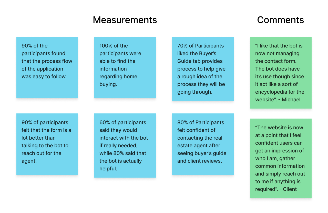
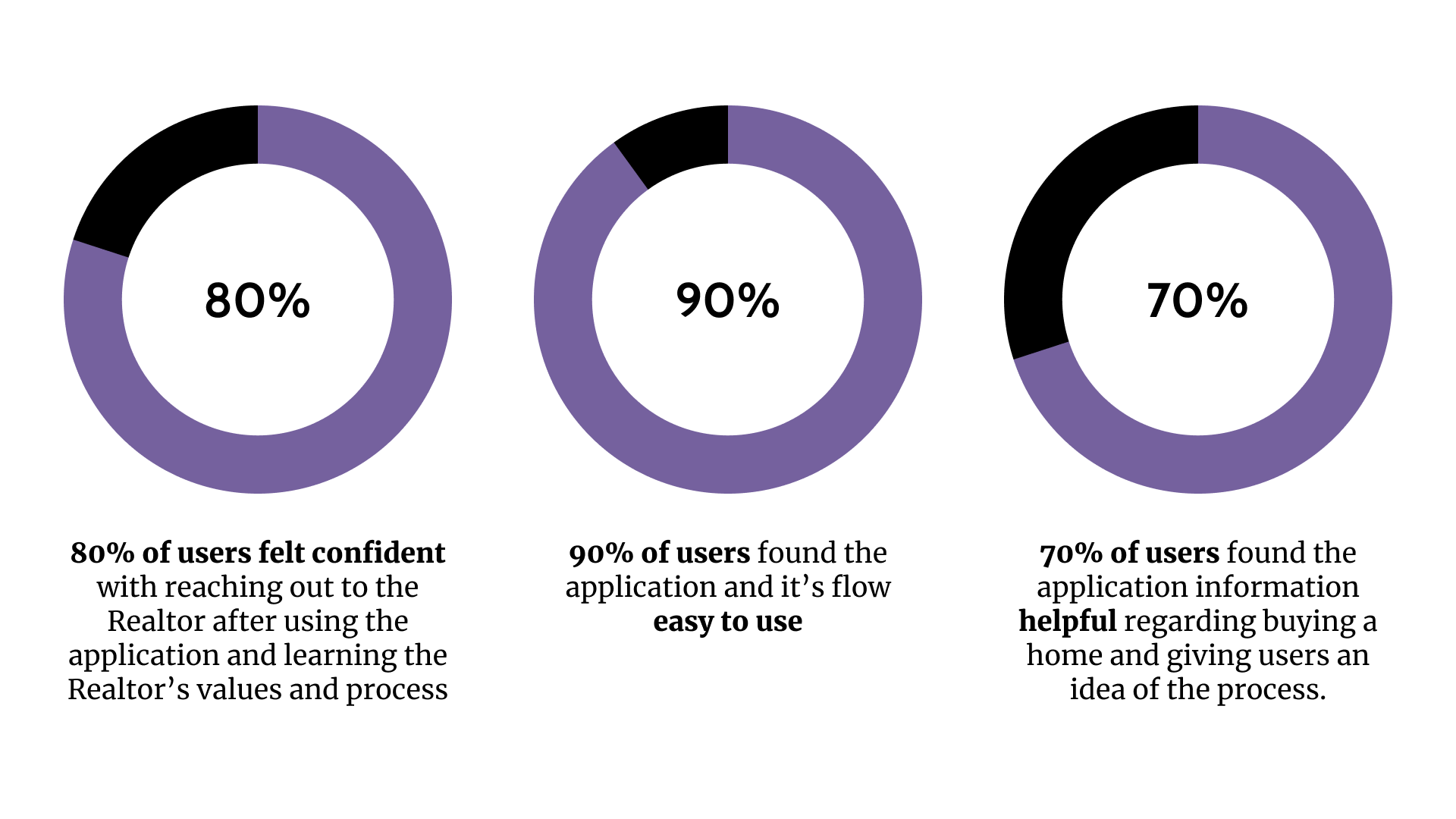
The final design has conveyed user confidence of 80% through resources such as reviews and having information about the Realtor such as their values and process. All participants were able to find information that I had asked for with the means of navigating or using the chat bot. The use of the bot is summed up very well through what Michael said during the second usability study "I like that the bot is now not managing the contact form. The bot does have it’s use though since it acts like a sort of encyclopedia for the website." Almost all users felt that the website was simple to navigate through the site. All in all, the client was satisfied saying, "The website is now at a point that I feel confident users can get an impression of who I am, gather common information and simply reach out to me if anything is required”.
Throughout my experience working on the UrbanScape Realty website I learned that communicating with both the stakeholder and users is a must when wanting to be successful in producing a product. Working with a timeline is also great deal to work on as I had to plan phases on what I need to have done at what dates to make sure I would be in schedule for completion of the website. The most important thing I learned was making decisions that might not appeal to every audience and still testing them as some features that I personally might not think can be applicable might work for a portion of the audience being designed for. For example, I added the AI chat bot for the sake of a small user group who might find it helpful and in the end I found a better way to incorporate it which made it a lot more useful.