Overview: A client wanted to create a mobile app design catering towards their user base.
Problem: The client realized that the previous application is causing users to not shop confidently. Users were also unmotivated to use the previous app due to appeal. Users also has issues findings information regarding sizing.
Solution: I developed the E-commerce Clothing App through user research, prototyping and testing to be able to deliver and bridge the gap of my client and the users.
Starting the creation of the E-commerce Clothing App, I conducted an interview with my associate to gather more requirements and information regarding their user needs. I had created a persona around what I had found from the interview and what I was able to research on my own. I made a user journey based on the persona to study emotions throughout a process. I started to then sketch and created prototypes that went through testing. I had noted down user feedback and choose to implement feedback that I organized through an affinity chart. With the implementation completed, I came to my final design.
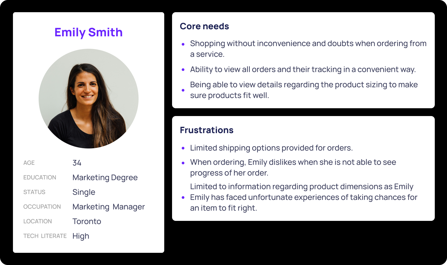
I conducted user research and had gotten feedback from my associate regarding user needs and pain points. I had come up with the persona below of Emily Smith. Emily is looking for a convenient way of shopping without creating doubts. Some of her doubt when shopping are presented when picking size of the product and seeing the progression of her order.
The sketches below portray the design I had in mind initially when creating the application. I focused on the main functions of viewing and tracking when sketching.
The usability study on the low and high fidelity models had brought in a lot of feedback from users. I had conducted sessions in person with 10 people where I gave users the same exercises, questioned them regarding their choices and emotion to the tasks. I noted my findings and aimed to improve each task however I could. The below is the affinity chart of the usability study findings for the high fidelity model.
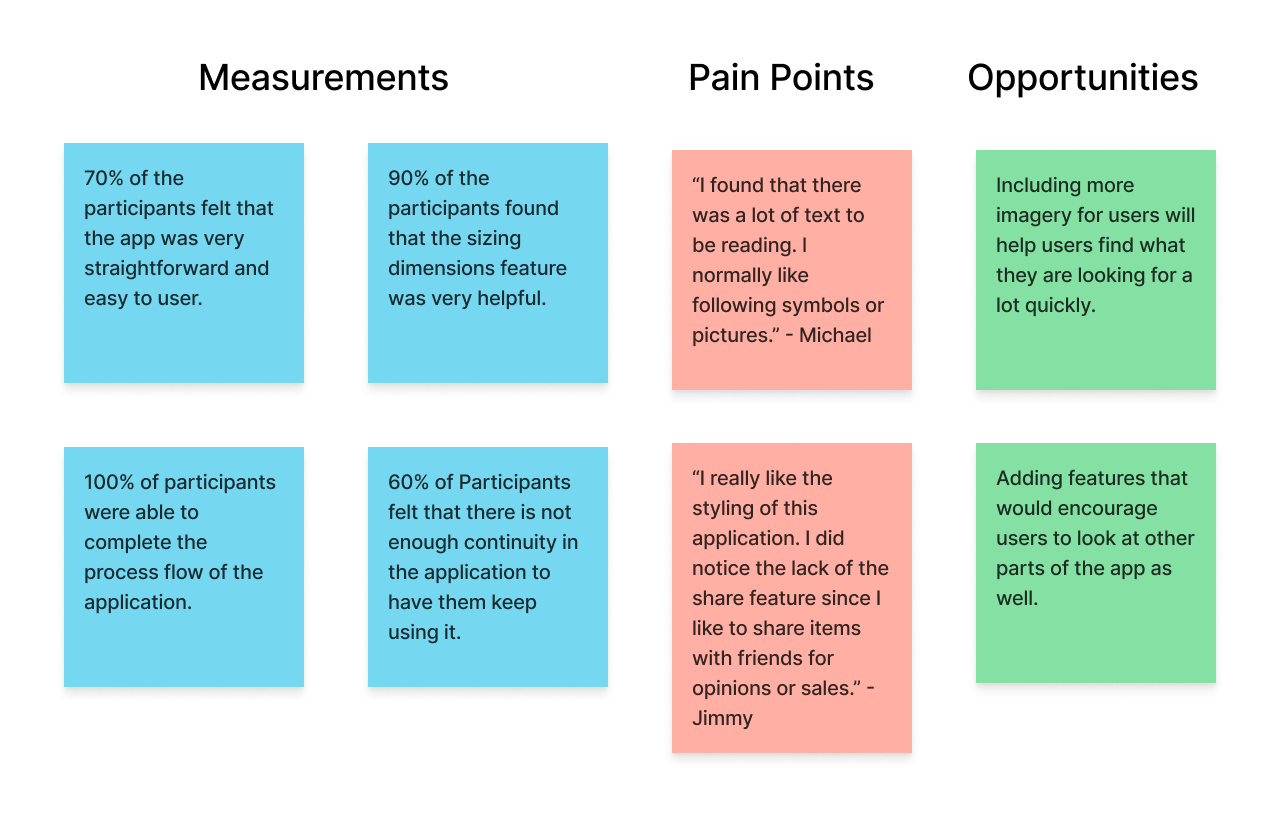
With the completion of the final usability study, I was given a lot of feed back to make enhancements to the high fidelity prototype that was presented to the users.
To provide more visual aides/accessibility and continuity for users, I added tiles with pictures to indicate categories that users might be interested in. I also added the featured items below to create continuity and pathways for users to explore when shopping for what they are looking for.
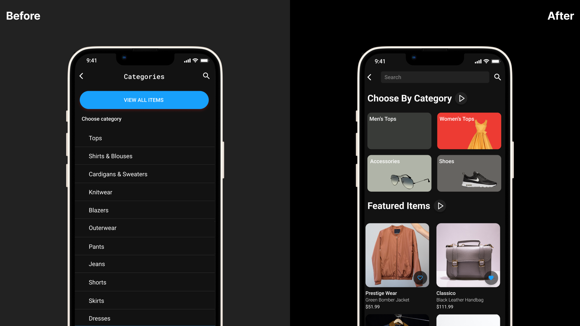
Michael from the usability study mentioned the use the symbols and visuals to help with finding options a user might be looking for. I implemented symbolism where possible such as in the profile tab to help users who look for visually cues.
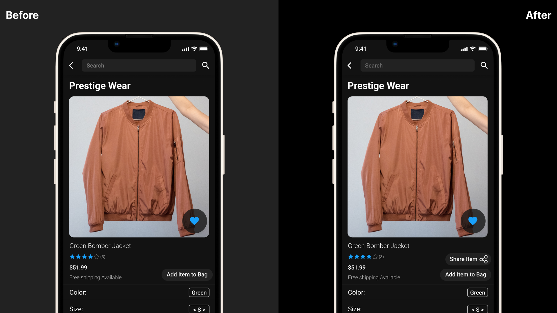
The last iteration I made was influenced by the user Jimmy as he pointed that there is no share button. Share buttons are very commonly used to communicate items to others and I also thought it would be a good idea to implement to the design. This feature will allow users to be more social with the application and provide traction as well since links can be shared among users.
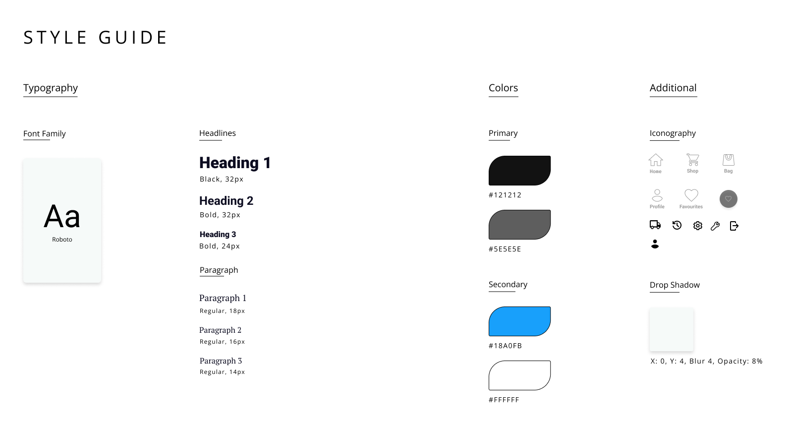
My styling guide prioritizes accessibility including colour-blind users. By using high-contrasting colour combinations and avoiding troublesome pairings, I was able to make sure users were able read and interact with the content. This approach was able to meet accessibility standards such as WCAG. As a result, the design is more user-friendly and effective for a diverse audience.
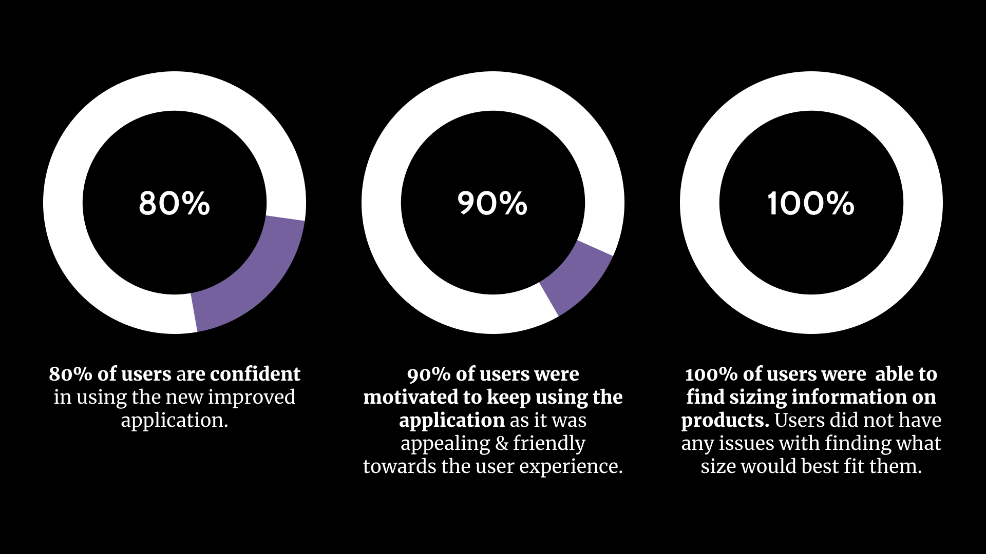
With the final design, I was able to confirm with users that 90% of them would like to continuously use this application with the implementations made with the final iterations. This was a good result since the previous usability study had conveyed that only 60% of users would like to continue to use an application like this. I also was able to tackle user pain points with solutions such as the sizing issue that was countered with the visual sizing chart. I was able help with user confidence by implementing a tracking system while also implementing a shipping option menu to allow users to take control of shipping timing.
I learned that with a project like this one, it's very important to consult both the stakeholder and users and be able to meet both of their needs. I learned the importance of user research and feedback as it helped make many iterations to the design and create successful results with the final design. I also learned to create an experience that would motivate users to interact with the design and other users. I also took from this project that taking inspirations and conducting an audit of industry designs can help a lot developing something that is unfamiliar to you.