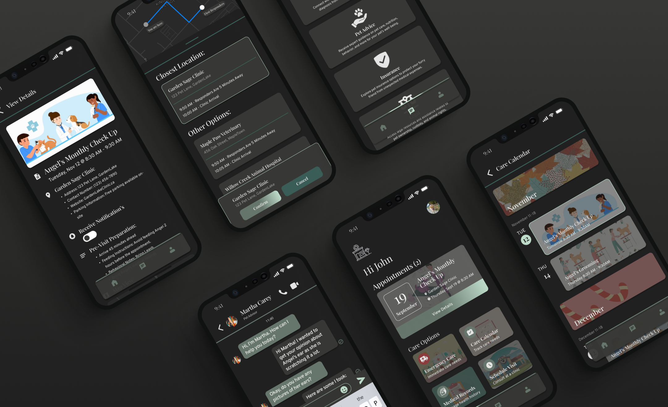
Solving Pet Care Challenges: How I Designed An Emergency and Community-Focused Pet App
Client
My Role
Platform
Context: Emergency care for pets is often an underappreciated aspect of animal healthcare, resulting in varied and sometimes challenging experiences for pet owners and their companions.
Problem: In an emergency situation, it is imperative for pet owners to act confidently to ensure their companion receives prompt medical attention. Various factors, including transportation availability, clinic accessibility, and waiting times, can contribute to delays, potentially wasting valuable time.
Solution: I designed an application aimed at being a resource for all pet-related needs, with a primary emphasis on emergency services to ensure pets receive necessary medical care.

- Stats & Literature Review
- User Interviews
- Affinity Diagrams
- User Persona
Conducting a competitive analysis of direct and non direct competitrs to understand current proccesses and services availables.
Analysing collected data to uncover key insights, trends, and gaps. These findings help highlight opportunities for improvement and innovation in current processes and services.

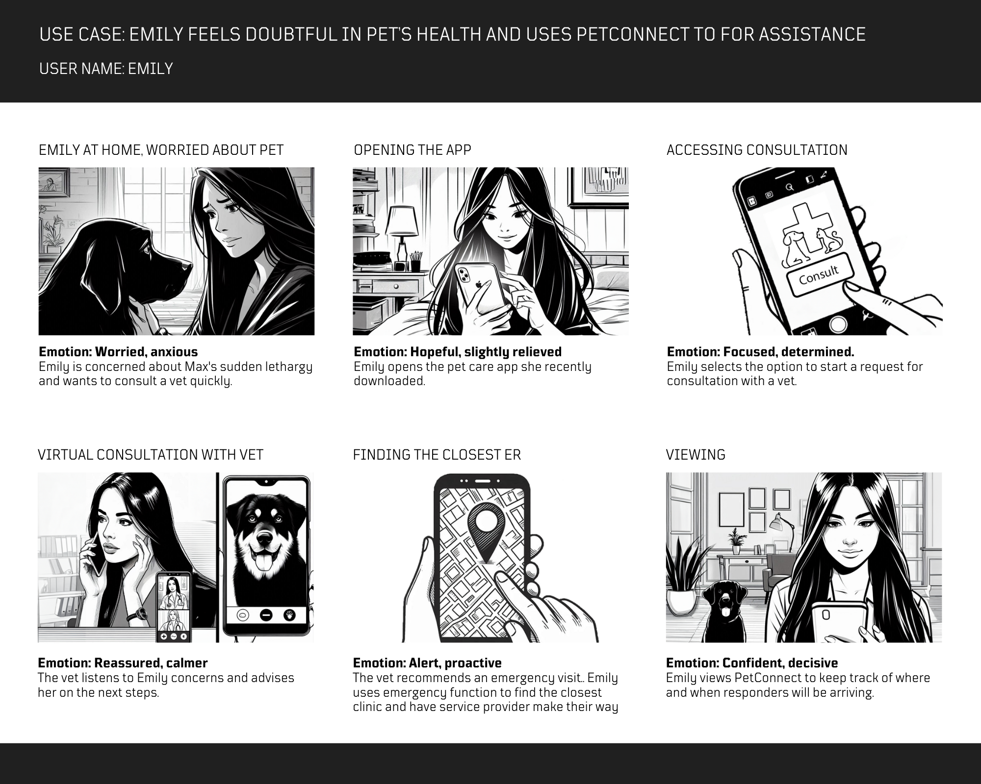
Visualizing user journeys and service interactions through storyboards to map out key touch points, identify pain points, emotions, and align on user-centred solutions.
Through researching online articles by credible sources, I found that there is a need for improvement in the veterinary emergency area. According to the online research article(Barriers and Lack of Access to Veterinary Care in Canada 2022) backed by the Toronto Humane Society, 24% of pet owners surveyed were unable to make an appointment for emergency care. Furthermore, 8% surveyed for emergency care mentioned they did not know where to go. Moreover, when compared to preventive care and sick care, emergency care had the highest showing for users not have the means to get to the location.
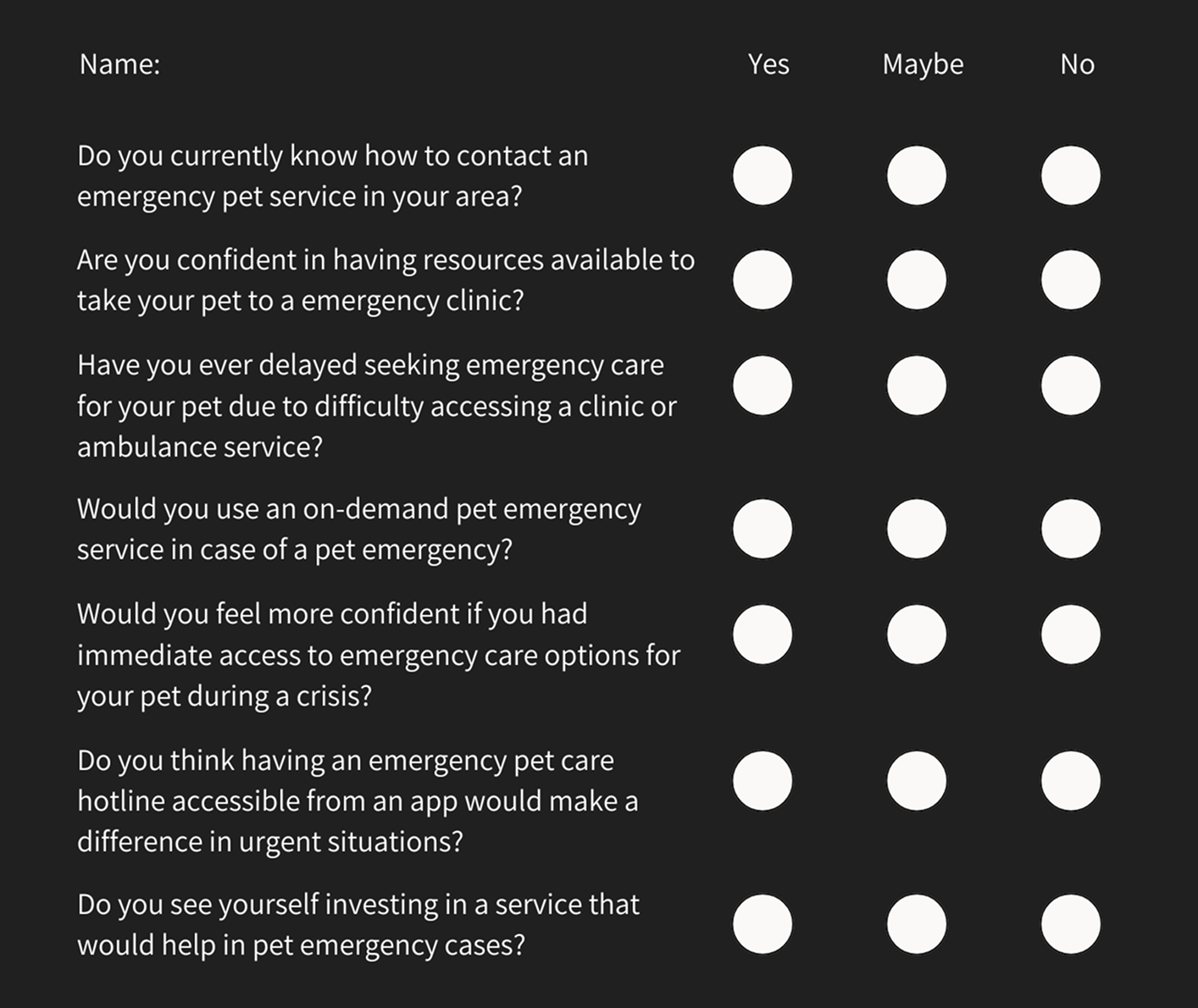
I conducted a series of structured interviews, asking users a consistent set of questions to gather data and insights on their experiences with emergency veterinary care. The goal was to understand whether this has been a challenge for them and to gauge their initial reactions to a potential solution addressing this need. Below are some of the questions I asked in the interviews:
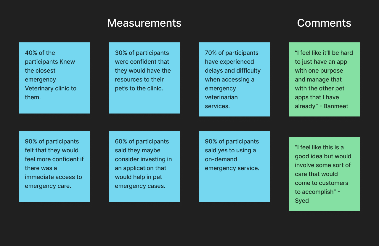
With the results of the interviews. I was able to make an affinity diagram to organize the insights and data collected. I also noted down some quotes from participants as I felt they were worth taking into consideration. One of the points I found very interesting one was "60% of participants said they may consider investing in an application that would help in pet emergency cases". After asking why, I received similar feedback that “I feel like it’ll be hard to just have an app with one purpose and manage that with the other pet apps that I have already”.
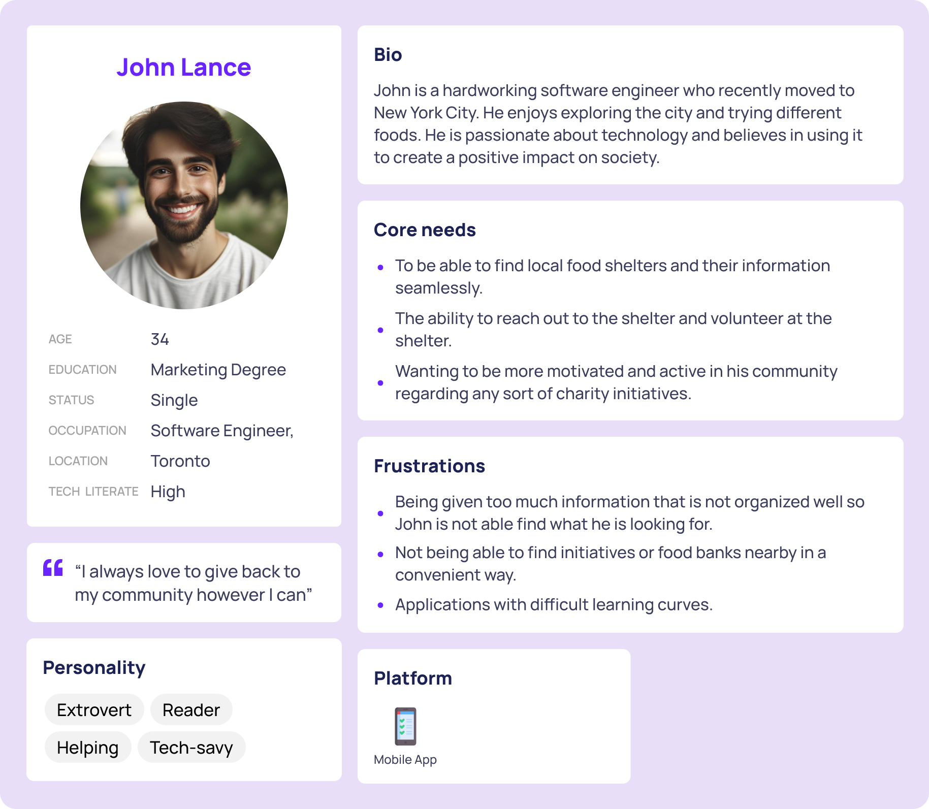
I wanted to gain a deeper understanding of the audience that was facing this problem. I developed a persona based on insights gathered from interviews with participants who have pets. This approach allowed me to capture a wide range of perspectives and characteristics of the target audience, which helped me empathize with the users. I noticed that participants did not just want to be able to perform one task , but rather have an all-in-one solution.
The competivive audit can be found here or by clicking the picture below:
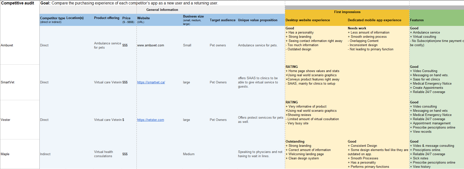
I discovered that the veterinarian ambulance process has not been modernized to the tap a finger. Currently the process is finding a regional provider and calling their phone number for assistance.
After conducting the user interviews. It was clear that users do not want a whole separate app for emergency services. Participants would prefer an all-in-app.

There is a lot of things that need to be done to create an app that would provide an ambulance service, such as the business and legal side of things. I decided to use a simpler & imaginative approach to the industry while modernising and improving the processes.
A solution would work mainly depending on the user's circumstances. In the case of where the participants I interviewed live and their situations, this is a solution that would work out for them, as resources are not always available, and there is a lack of information for emergency pet services available within their area.
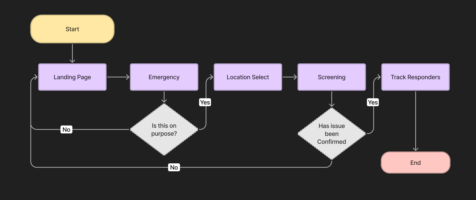
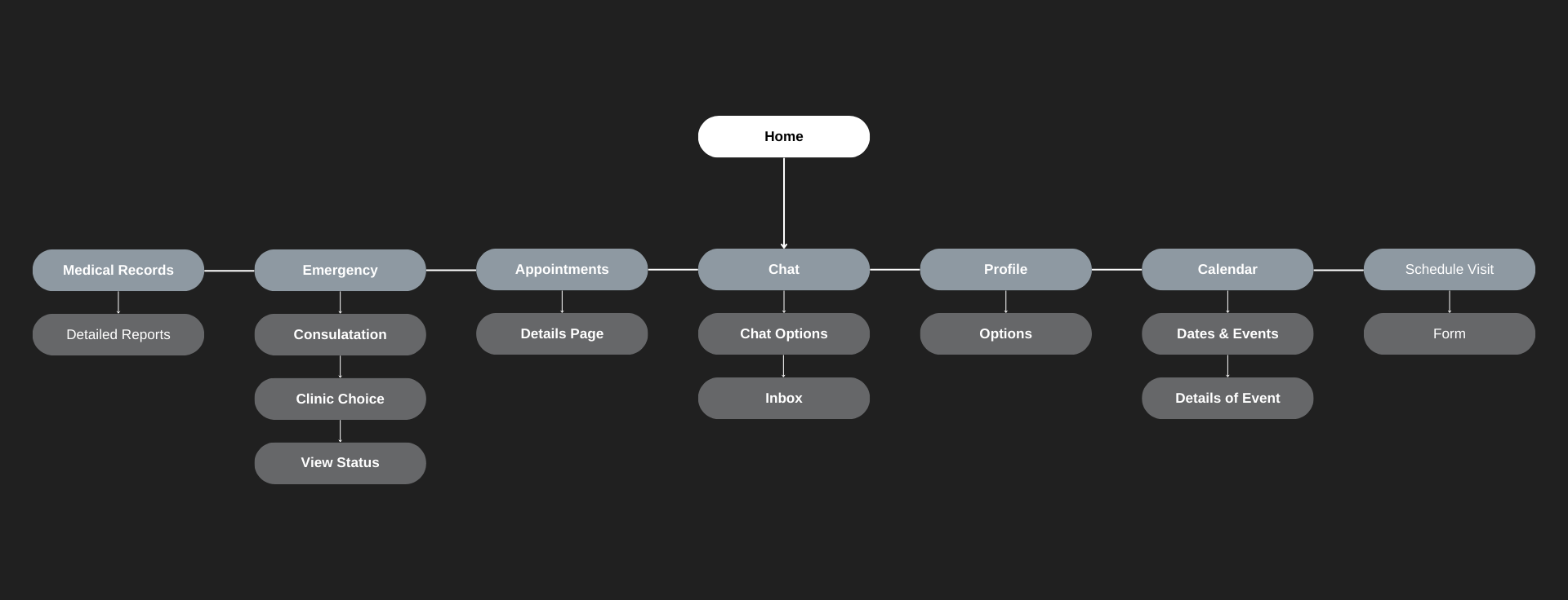
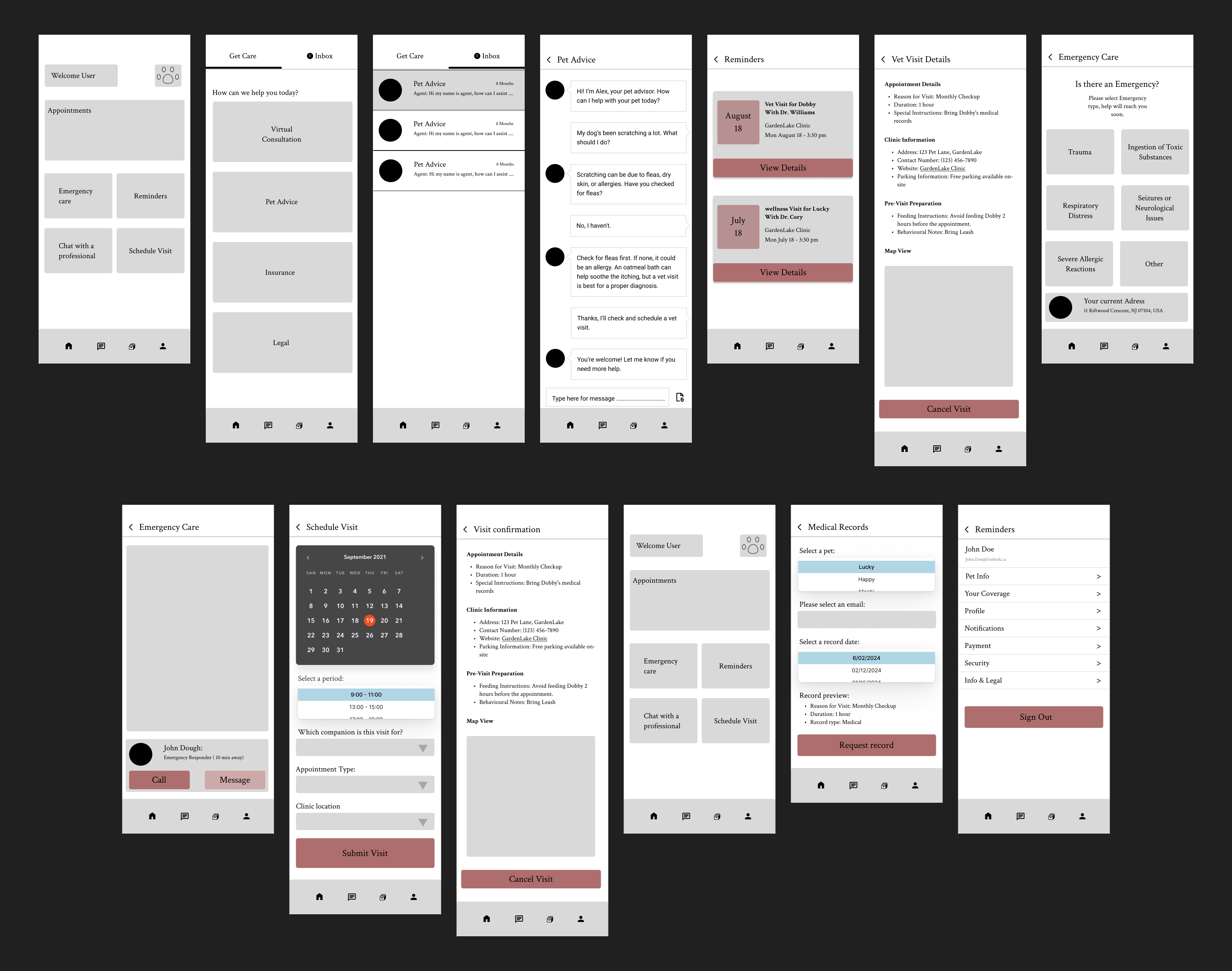
When starting to design, I created a list of use cases I've gathered through my research that would be performed and mapped out the flows to better understand what pages, forms, and functionality I would need to add for the experience. Below, I cover the flow of the emergency selection. This led me to create a site map to understand, organize, and review the application while highlighting what pages and features I would require for the prototypes. I then created wireframes using Figma, representing the operation of the flow the application would follow to meet flow requirements.
With the creation of the high fidelity prototype, I conducted a usability study consisting of 4 key tasks for users to perform. I wanted to make sure these tasks would be easily performed with little to no errors. I always go into usability studies with an open mind, trying to empathize with users and have them speak their minds as much as possible. This allows me to view situations from a different perspective and form new ideas to help improve the design. I also like to get opinions on the visual aspects from other designers to see what can be improved upon. Below you can find the use cases and usability study I performed with the help of volunteers.
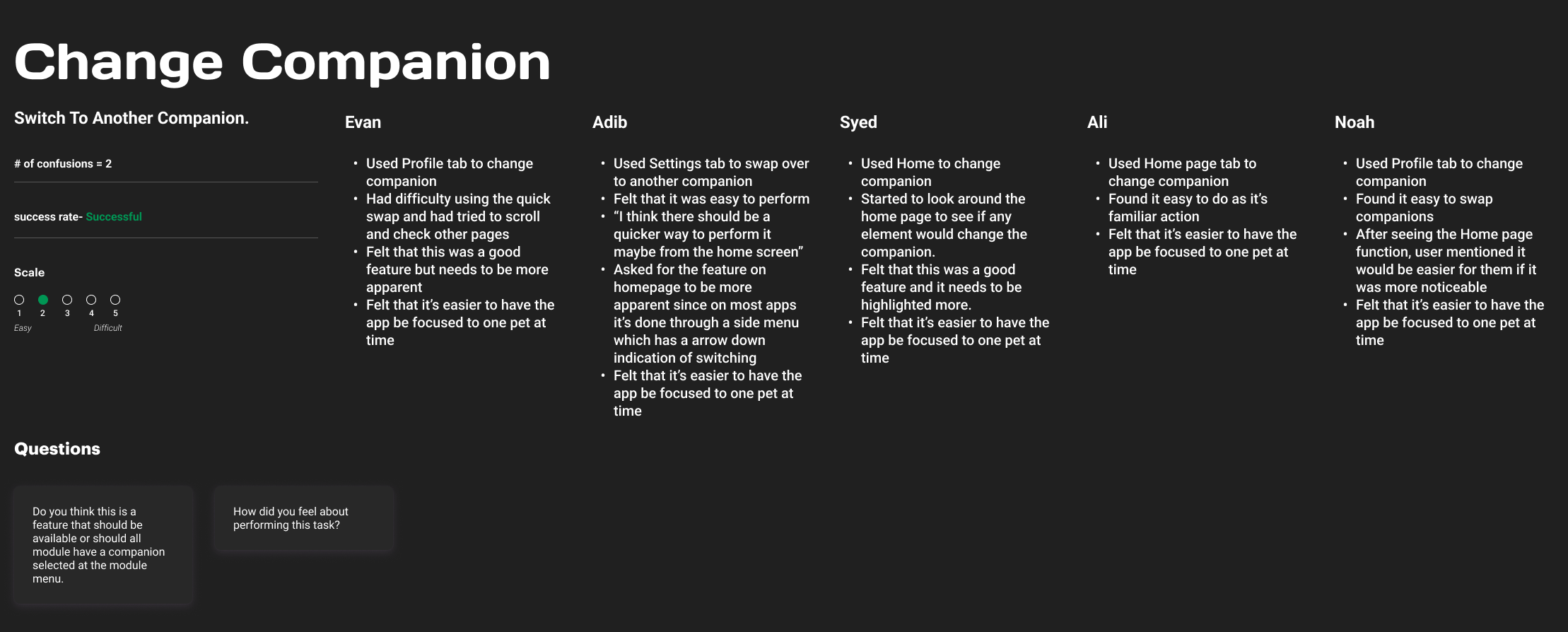
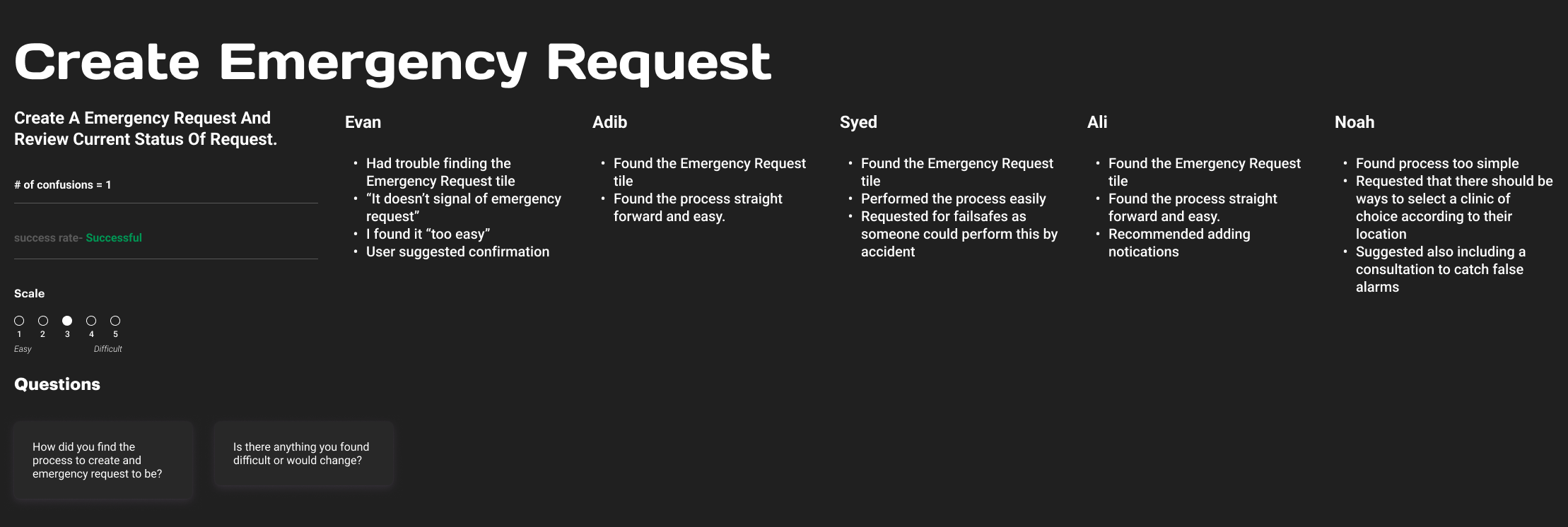
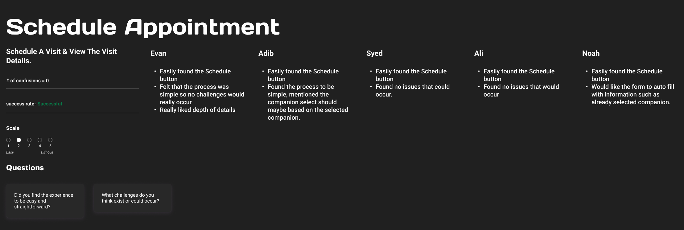
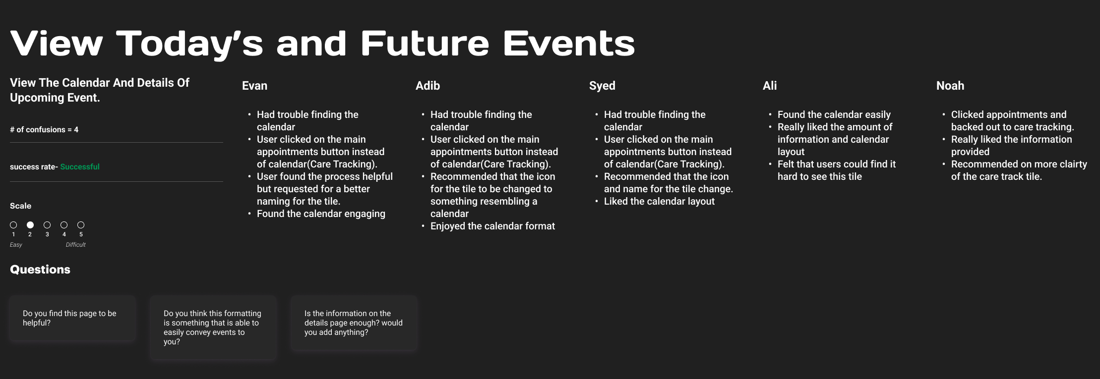
After the usability study, I organized and prioritized feedback to identify key areas for improvement. These changes focused on enhancing the user experience through logical and design adjustments.
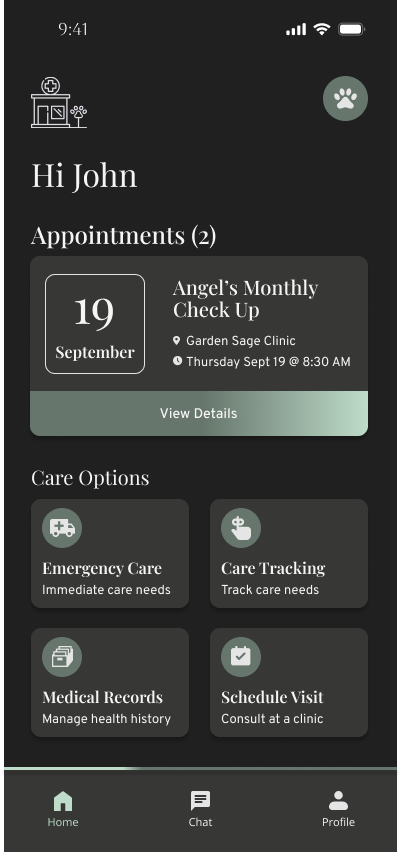
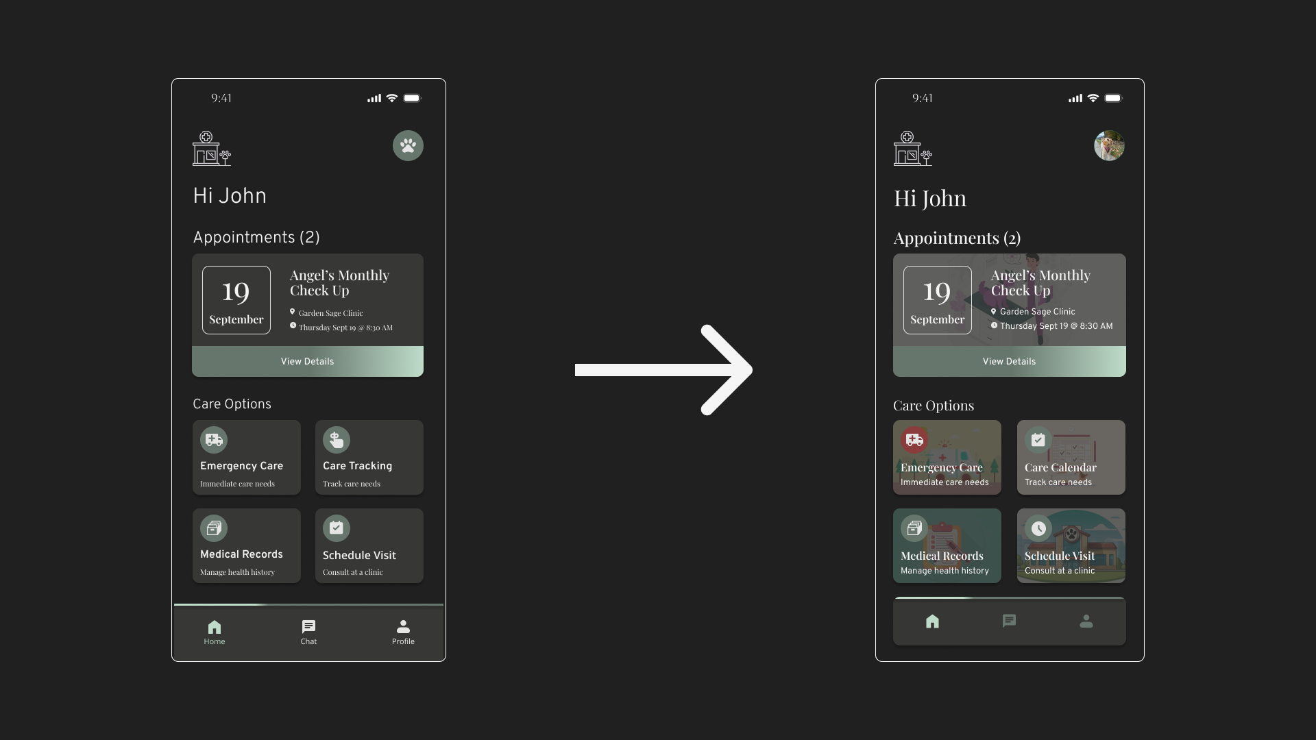
As mentioned before, I had the design reviewed by a designer. One comment made was "this application has no real identity to it, this app could be anything, like even a funeral app". This feedback prompted me to revisit my competitive audit and explore how other platforms establish their unique identities. I incorporated more graphics, animations, and custom elements to create an experience tailored specifically for pet owners. Below are the changes made to the app's entry and home page.

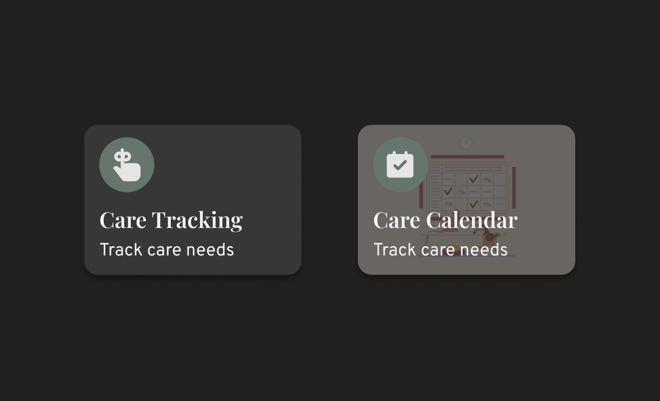
During the usability study, it became evident that users struggled to access the feature for viewing current and upcoming events. The main issue was the misleading naming and iconography of the button. I updated the icon to represent events and dates, and included the word 'calendar' in the button label to enhance clarity. I addressed the legibility issues by adjusting the typography, ensuring that font sizes are appropriate and styles are bold enough to be easily readable. This change is particularly important for mobile users who may struggle with small or thin fonts.
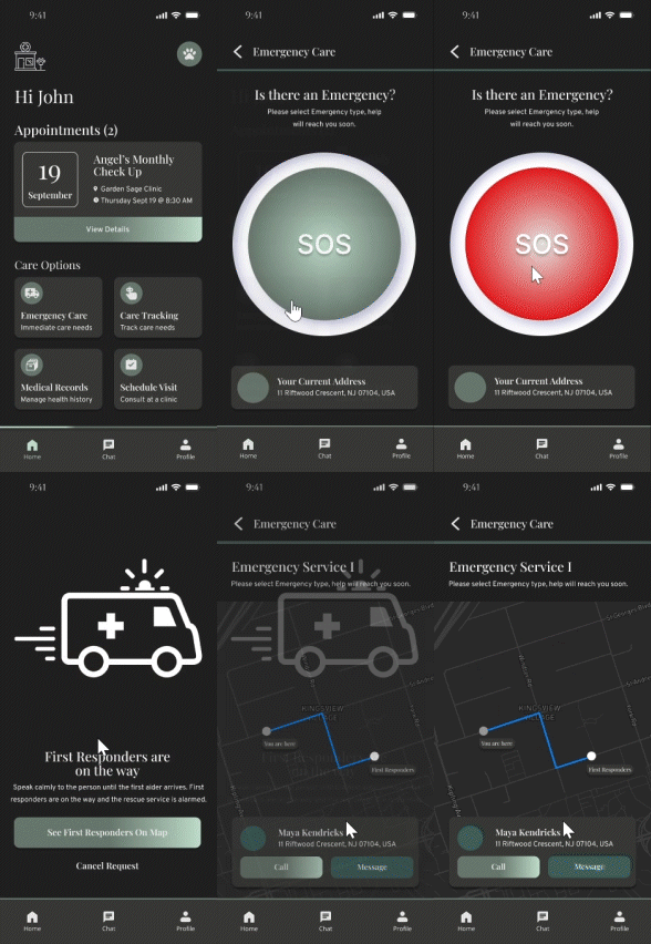
During my usability study, users expressed concerns that the emergency process seemed overly simplistic. While ease of use is important, the feedback highlighted the need for additional precautions given the critical nature of emergencies. Previously, there were no confirmations and precautionary screenings. The enhanced design now includes a confirmation step to ensure that the request is being processed, along with a screening process to verify the emergencies and provide users with guidance on what actions to take. Additionally, a location selector has been added, allowing users to choose their preferred clinic for emergency care.
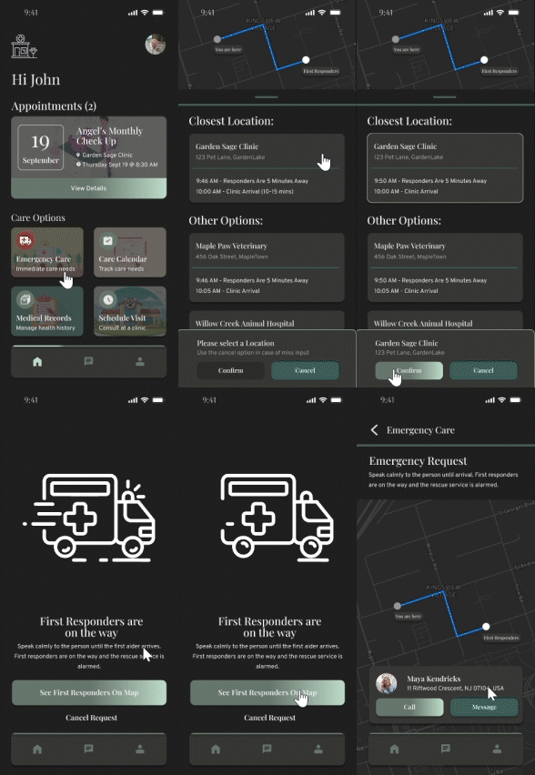
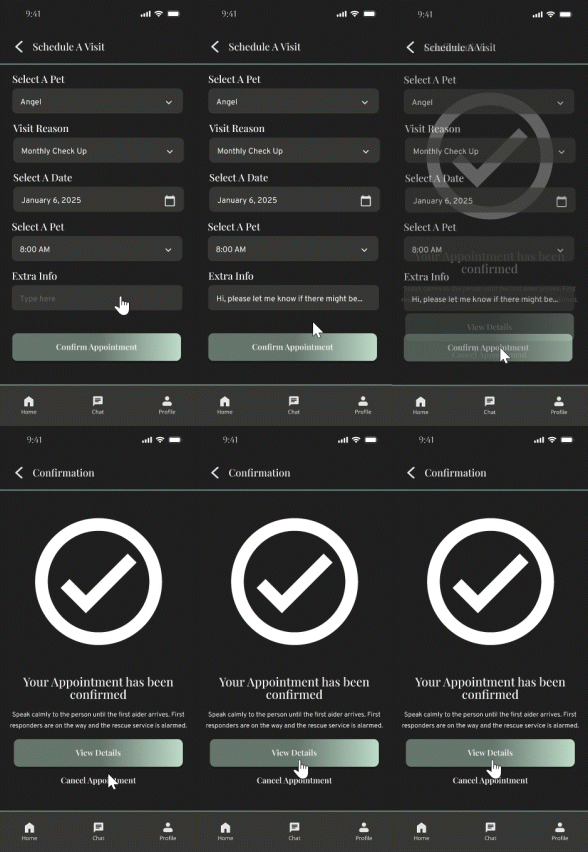
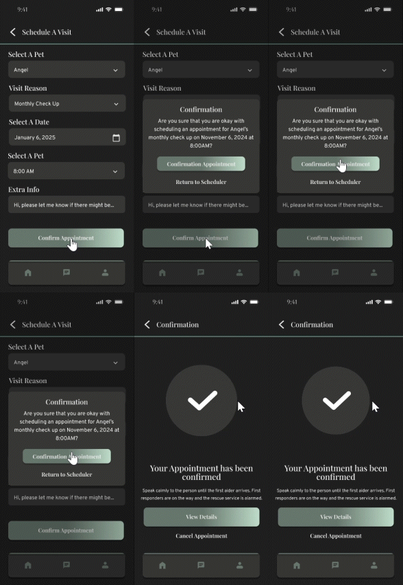
Throughout the application processes, many use cases lacked confirmation steps, leaving users uncertain about their selections. To address this, I have implemented overlays that provide clear confirmation of user actions and offer easy access to review their choices. For instance, in the scheduled visit use case, users now receive a confirmation and can view detailed information about their appointments, ensuring a more informed and confident user experience.
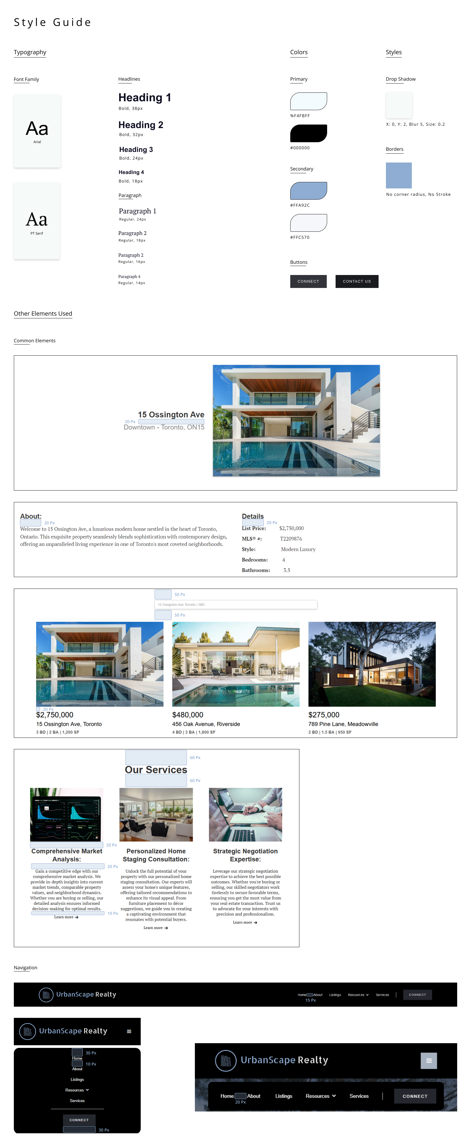
Typography: For typography, I selected a combination of Playfair Display and Overpass. Playfair Display is used for headings due to its elegant, eye-catching style that maintains strong legibility. For body text, Overpass was chosen for its clean, modern appearance and high readability, making it ideal for longer content.
Color: Extensive experimentation went into color selection to ensure optimal contrast and legibility. The primary palette features #202020 and #F5F5F5, creating a clear visual hierarchy and structure. Secondary colors — #373735, #66766C, and #BEDCC9 are used for selection states and iconography, introducing a warm, approachable tone while maintaining a distinctive visual identity.
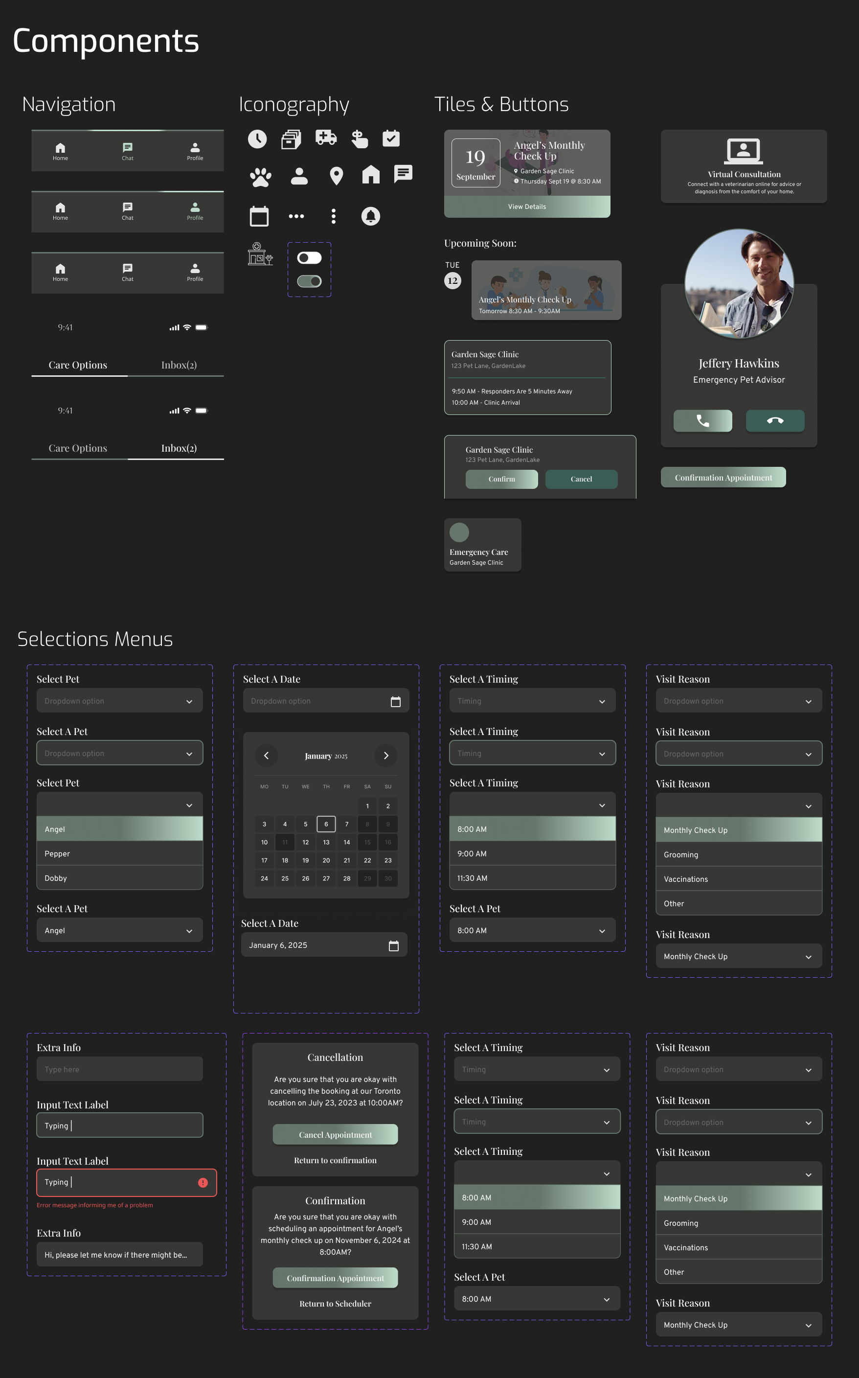
UI Components: Reusable UI components such as buttons, dropdowns, and tiles were designed to support consistency across the interface. These elements follow a modern aesthetic, balancing functionality with a clean, user-friendly look.
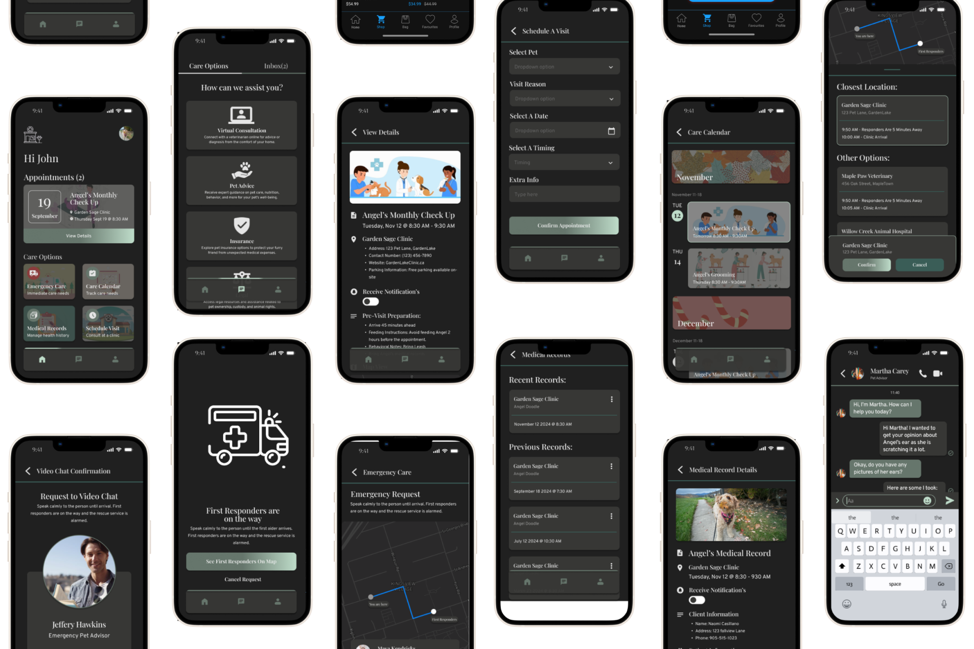
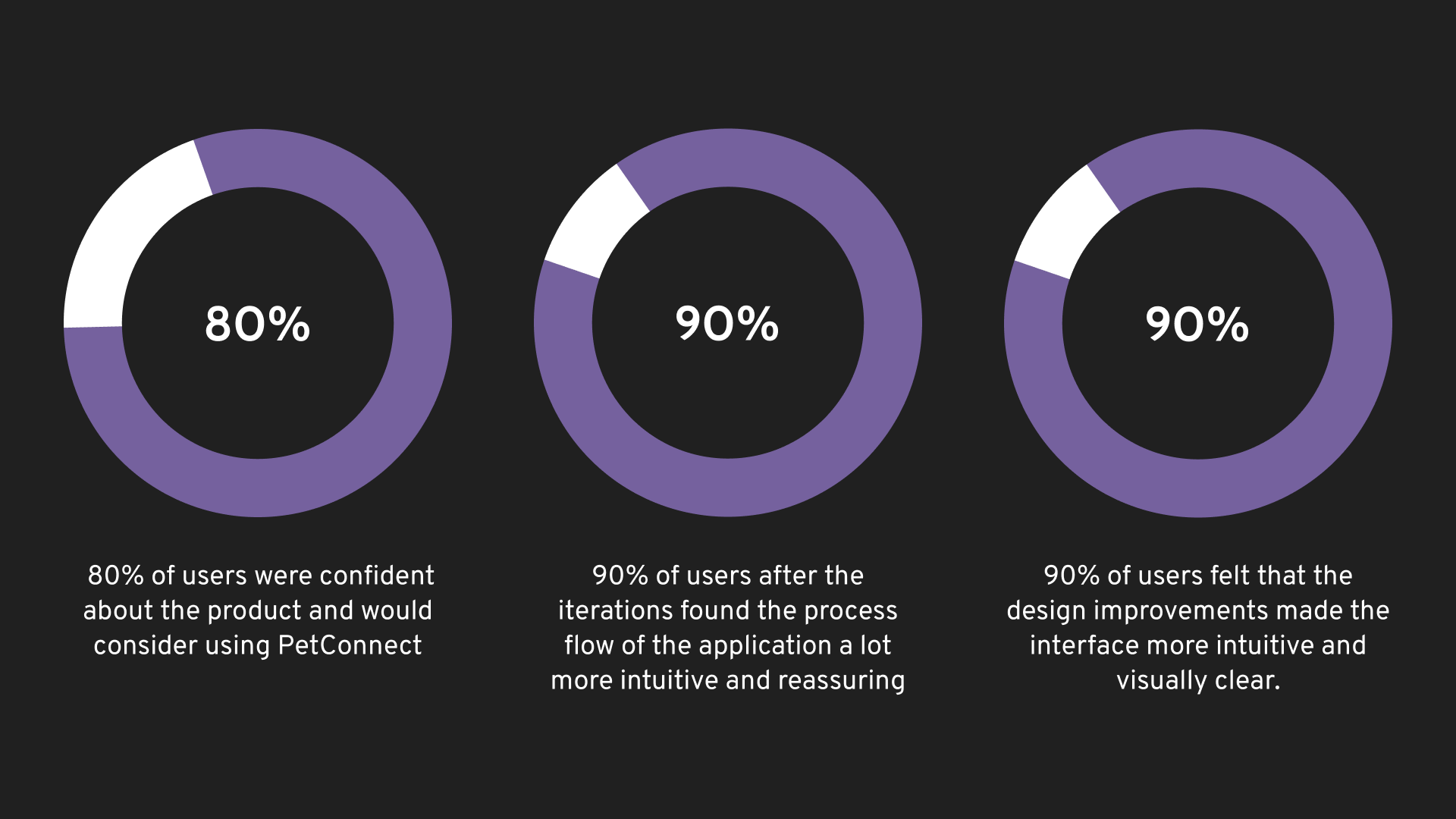
Overall, after re-evaluating the participants with the final design, 80% of users expressed confidence in the product and indicated they would consider using PetConnect. Following the iterations, 90% of users found the application easy to navigate due to its straightforward flow. Additionally, 90% of users felt that the design improvements made the product very clear and intuitive. Users were highly satisfied with the product and are eager to see further developments.
Creating PetConnect taught me that user experiences can vary greatly even in identical situations. This diversity made it challenging to design the app for a specific audience. Fortunately, I had access to many pet owners in my network who shared their experiences. I discovered that while there are existing services offering similar features, there's potential for growth, such as involving professionals who can assist in emergencies. The concept can expand based on available resources. Additionally, I gained insights into the business side of the industry, which can be complex with services offered as SaaS or standalone. On the design front, I learned the importance of choosing colors that are easy on the eyes in stressful situations and ensuring accessibility for quick task completion. I also incorporated screenings, checks, and confirmations to streamline processes. Lastly, I realized that a generic design lacks character, and giving it a personality can encourage user engagement.
Thanks for scrolling all the way down. You have excellent taste.